
When it comes to designing a beautiful and comfortable living space, colour plays a much bigger role than you might think. Beyond aesthetics, the colours you choose can influence mood, energy, and the overall feel of your home. That’s where colour theory comes in—a foundational concept that helps you understand how colours interact and how to use them effectively.
Let’s dive into the basics of colour theory and how you can apply it to your home decor.
🌈 What Is Colour Theory?
Colour theory is a set of guidelines that designers use to create harmonious colour combinations. At its core is the colour wheel, which consists of:
-
Primary Colours: Red, Blue, Yellow
-
Secondary Colours: Green, Orange, Purple (created by mixing primary colours)
-
Tertiary Colours: Combinations of primary and secondary colours (like teal, magenta, or amber)
By understanding how colours relate to each other on the wheel, you can build a palette that feels balanced and intentional.
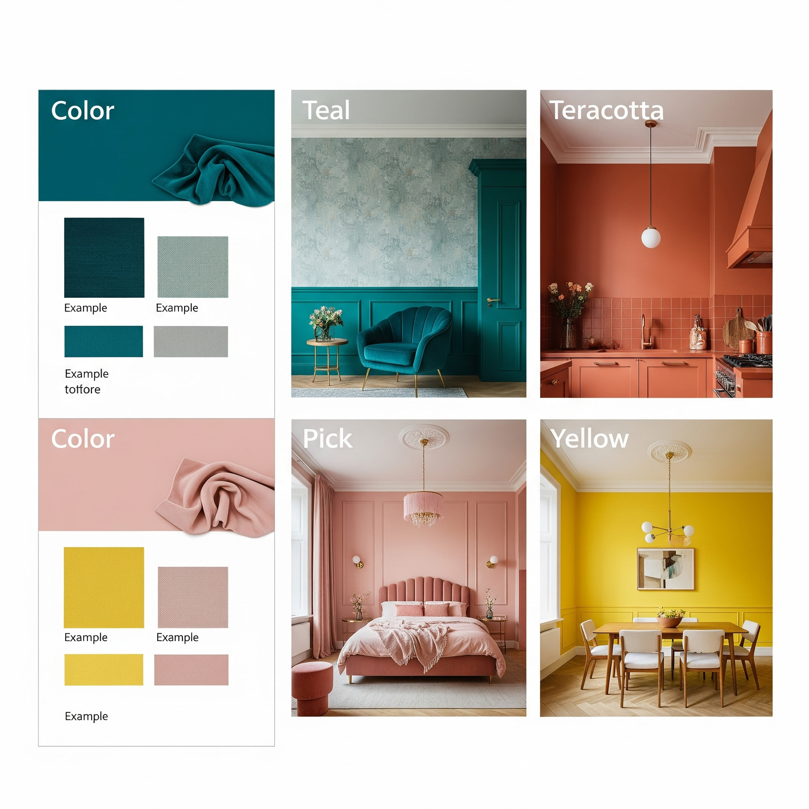
🛋️ Key Colour Schemes for Home Decor
Here are a few colour schemes based on colour theory that work beautifully in interiors:
1. Monochromatic
-
Uses different shades, tones, and tints of one colour.
-
Example: A living room in soft greys, charcoal, and white accents.
-
✨ Result: Elegant, cohesive, and calming.
2. Analogous
-
Combines 2–3 colours next to each other on the wheel.
-
Example: Blue, teal, and green in a bathroom or bedroom.
-
✨ Result: Natural and serene, often inspired by nature.
3. Complementary
-
Pairs colours opposite each other on the wheel (like blue and orange).
-
Example: A navy couch with burnt orange throw pillows.
-
✨ Result: Bold and vibrant, high contrast.
4. Split-Complementary
-
A main colour plus two adjacent to its complement.
-
Example: Soft green with hints of coral and mustard.
-
✨ Result: Balanced yet lively.
5. Triadic
-
Three colours evenly spaced on the colour wheel.
-
Example: Red, yellow, and blue accents in a modern kitchen.
-
✨ Result: Playful and dynamic, best used with restraint.
🧠 Colour Psychology: How Colours Make You Feel
Each colour evokes certain emotions. When decorating, it helps to match colours with the room’s purpose:
-
Blue: Calming, great for bedrooms or bathrooms
-
Green: Restful and refreshing—ideal for living rooms
-
Yellow: Energizing, perfect for kitchens or breakfast nooks
-
Red: Stimulating, often used in dining rooms (use sparingly!)
-
Neutral tones (white, grey, beige): Versatile and grounding, a base for layering
🏡 Tips for Applying Colour Theory at Home
-
Start with a Base: Choose a neutral tone as your base, then add pops of colour through furniture, rugs, or decor.
-
Use the 60-30-10 Rule: 60% dominant colour, 30% secondary, and 10% accent.
-
Test Paint First: Colours look different depending on lighting—always test samples on your wall.
-
Consider Natural Light: South-facing rooms get warm light, while north-facing rooms feel cooler.
-
Add Texture: Even within one colour, using various textures (linen, wood, metal) adds depth.
🖼️ Real-Life Examples
-
Boho Bedroom: Uses an analogous palette of rust, terracotta, and blush pink.
-
Scandinavian Living Room: Monochromatic whites and greys with a splash of dusty blue.
-
Eclectic Dining Area: Complementary navy walls with mustard chairs and warm wood accents.
🎯 Final Thoughts
Colour theory isn’t about rigid rules—it’s about understanding how colours work together so you can create a home that feels like you. Whether you prefer calm and neutral spaces or bold and colourful rooms, a little knowledge of colour theory will help you make intentional choices that bring beauty, balance, and personality into your home.